Overview
Duration
1 Week
My role
UX Design
UX Research
Product Thinking
Background
The Basics of Coda
Coda is a powerful online document management solution that brings teams together by combining features from spreadsheets, presentations, word processor files, and different apps. The founder and CEO of Coda, said that with Coda, “people can build things that really compete with end-to-end apps.” In other words, Coda encourages users to create a solution that works perfectly for them through the utilization of customizable building blocks — including document-building elements, interconnected tables, complex formulas, and buttons/automations that streamline workflows.
Why coda?
The Search For The Perfect Project Hub
As a student and someone who relies on strong visual organization, I’ve been using Coda to organize my work by keeping track of different project deadlines and notes. With automations such as being able to make time or button based actions, templates for different notes docs and project goals, as well as just general flexibility to completely customize and organize my workflow, it’s greatly improved both my productivity and thoroughness.
For my more data-heavy projects, Coda has proven useful for handling large amounts of data with a variety of different types. But, during a recent project for a data science class, I realized that Coda’s graph and chart view options were limited in terms of their functionalities and features and ultimately had to move to Google Sheets (one of Coda’s biggest competitors) to finalize my work.
After reading the Kleiner Perkin’s Summer Fellowship prompt to “Redesign a feature from any of the companies in the Kleiner Perkins portfolio,” I knew that I wanted to explore this pain point of Coda further, and see how the chart feature could be redesigned to improve the company’s data-visualization experience.
Usability testing research
How do Users Currently Interact with Coda?
Although I had spent lots of time playing around with the charts on Coda, I wanted to learn from other people’s experiences and their pain points. To do this, I interviewed 10 people with a variety of backgrounds, including both college students like myself and working professionals across companies in the tech industry (Note: Most of the people that I interviewed had not extensively used Coda prior, but had some previous experience using spreadsheet or graphing software).
My main goal for the user testing was to understand the user pain points while interacting with the following aspects of Coda’s chart interface:
Facilitating Chart Selection: Are users able to easily determine what type of chart best fits their data while considering factors such as data complexity and visualization requirements?
Manipulating Axis and Column Values: How do users navigate and modify axis and column values within the data visualization interface, and what challenges, if any, do they encounter during this process?
Leveraging Styling Options: How do users utilize the currently available styling options (ex. colors, stacking, etc.)? How do these options contribute to the clarity of their charts?
Data Expansion: Are users able to seamlessly add new data to the existing dataset? Can they easily view/edit other data values?
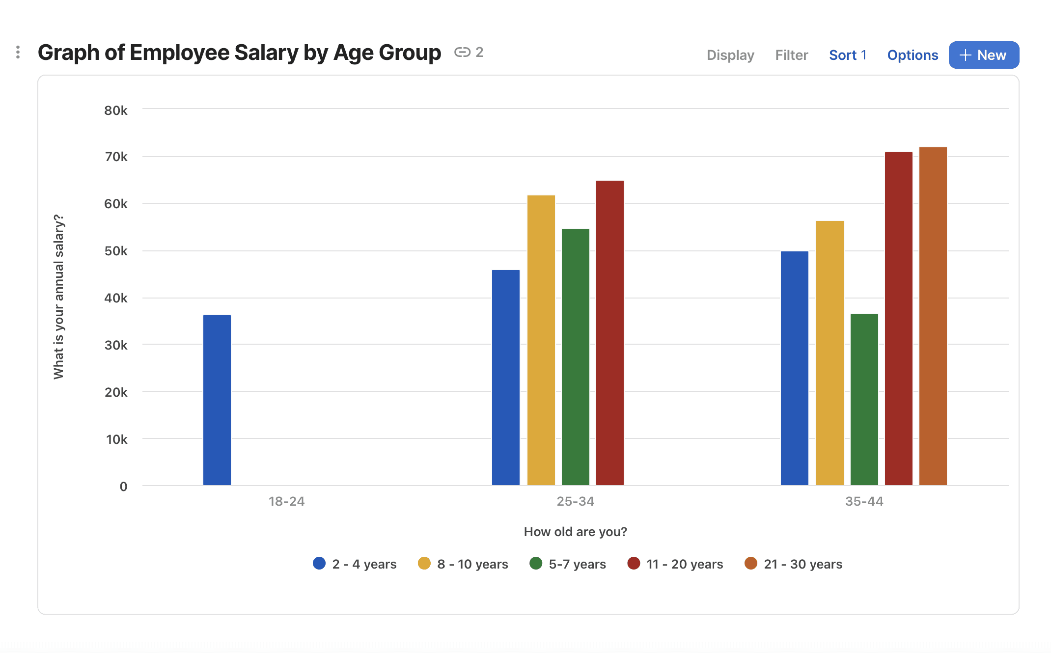
For my sample data for the interviews, I used the sample data provided in Coda’s “Databases 101” tutorial set. The dataset contains information about several employees, including their age range, salary, experience level, and job title — due to the wide variety of column types, I found this to be a relevant use case for testing Coda’s chart features. Given my goals for the user testing, I created the following task for all 10 interviewees to complete while walking me through their thought processes:
Understanding key pain points
Usability Test Results
Current chart type options.
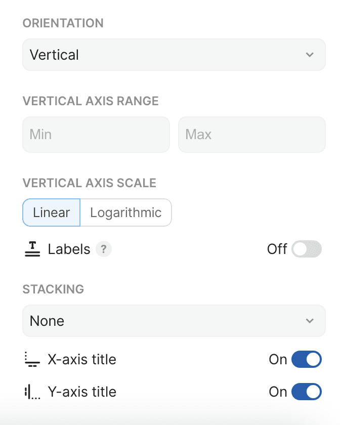
Lack of strong visual hierarchy among the many chart settings.
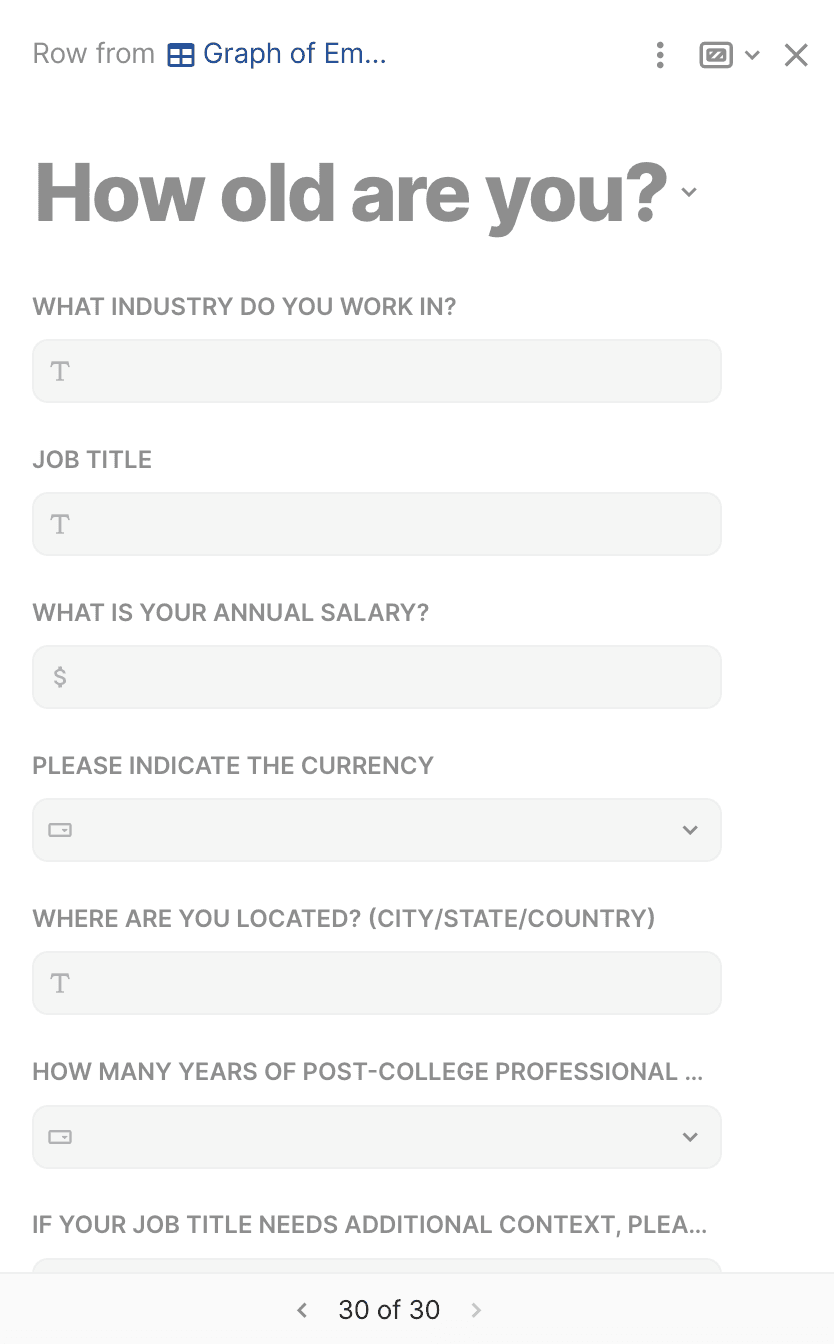
Adding or editing new data is confusing and hard to navigate.
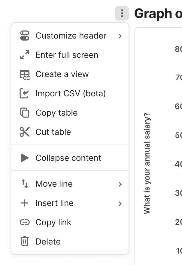
Users can copy and paste charts, but not export them.
Opportunity
How should Coda simplify their data visualization opportunities to reduce user confusion and enhance the clarity of navigating chart types and settings for a more intuitive user experience?
initial ideas & goals
Ideation & Sketching
Based off of the key insights from my usability testing, I began to ideate ways that Coda could provide a more secure and organized experience through its chart settings.
Key Goals of the Redesign
Prioritize efficiency in both chart creation and editing.
Localize editing within the chart feature (remove need to access external tools).
Create a more intuitive experience for users who may be new to data visualization.
The final designs
Introducing a New Data Visualization Experience!
Solution #1: More intuitive chart customization options.
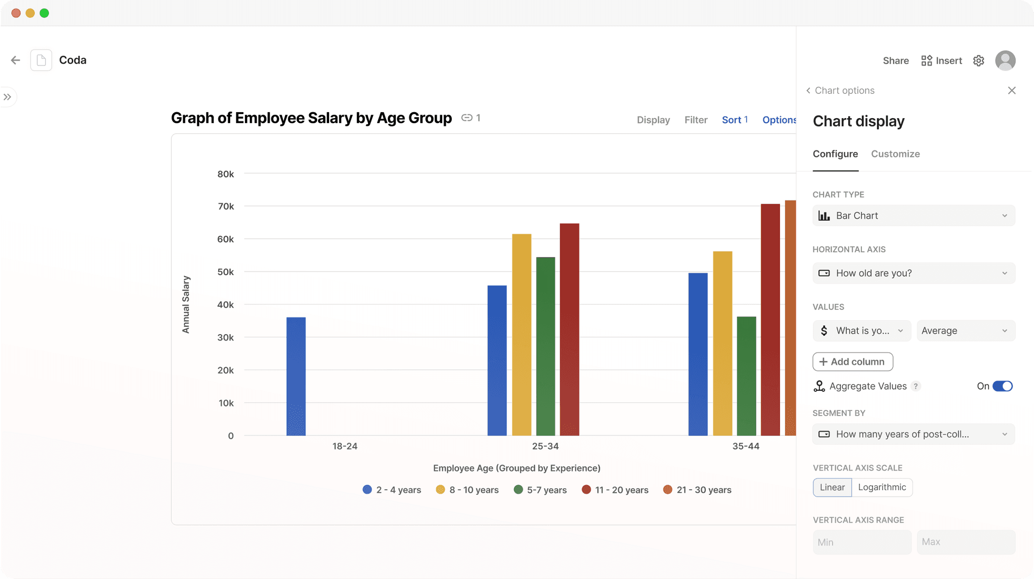
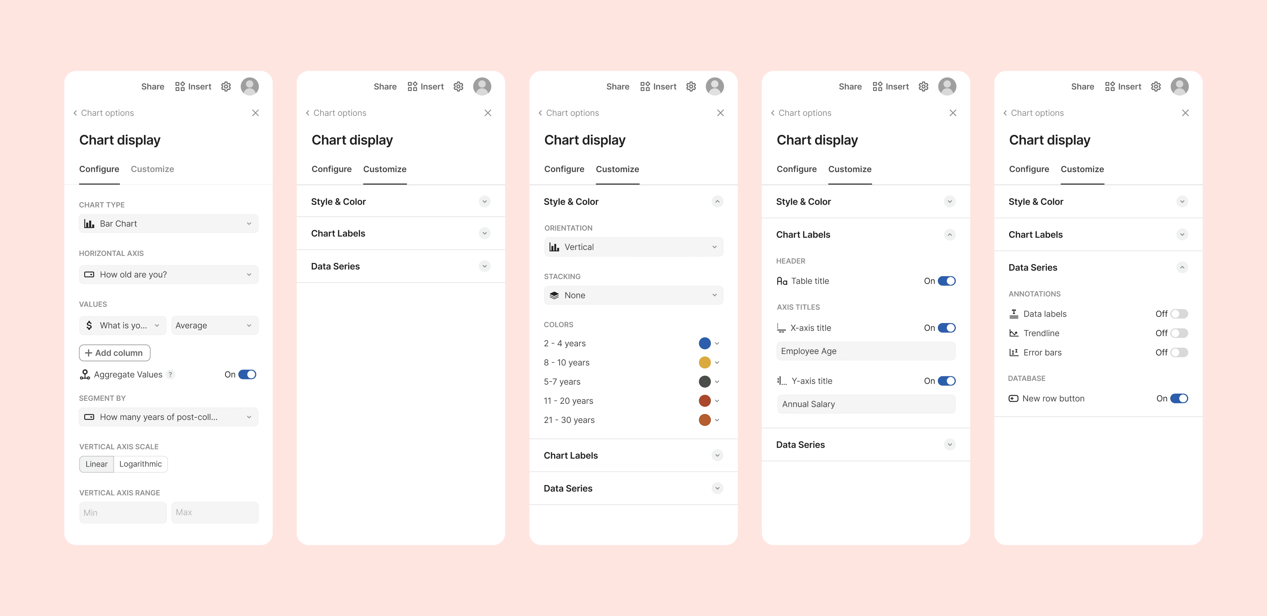
Users struggled with being able to find and access the relevant settings that they wanted to change, due to them currently being in a very long, scrollable list. In the redesign, the settings are split into two different sections: “Configure” and “Customize.” Within the Configure section, users can edit the data options of the chart, such as the chart type, axis, values, segmentation, and vertical axis.
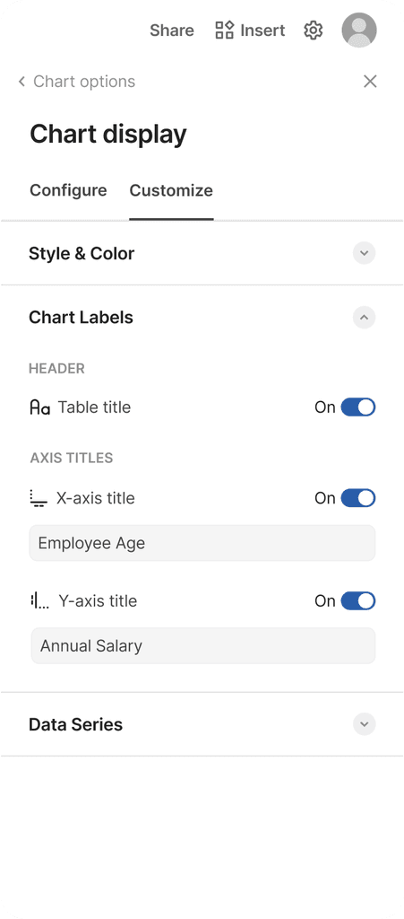
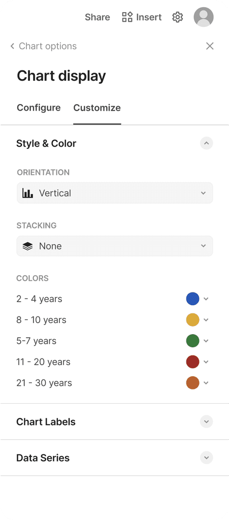
In the Customize section, users are provided with an accordion menu with three different sections, which allows users to be more direct within their setting selection, and provides more guidelines and a stronger visual hierarchy for the different visual settings.
Style & Color provides the users the optionality of the orientation, stacking, and chart colors.
Chart Labels includes the table title, as well as a new feature of editable axis titles, which allow users to create more comprehensive axis titles if necessary instead of directly drawing from the table column/row headers.
Data Series allows users to turn on data labels, as well as contains the new trend-line and error bar features that address some of the highly requested statistical functionality features and an option to be able to add new rows to the database.
The improved organization and optimization of the chart settings encourages users to make more purposeful decisions when creating charts, and provides more optionality for making quick changes.
Redesigned chart display settings that prioritize efficiency and ease of use.
Solution #2: Easily visualize charts through smart recommendations.
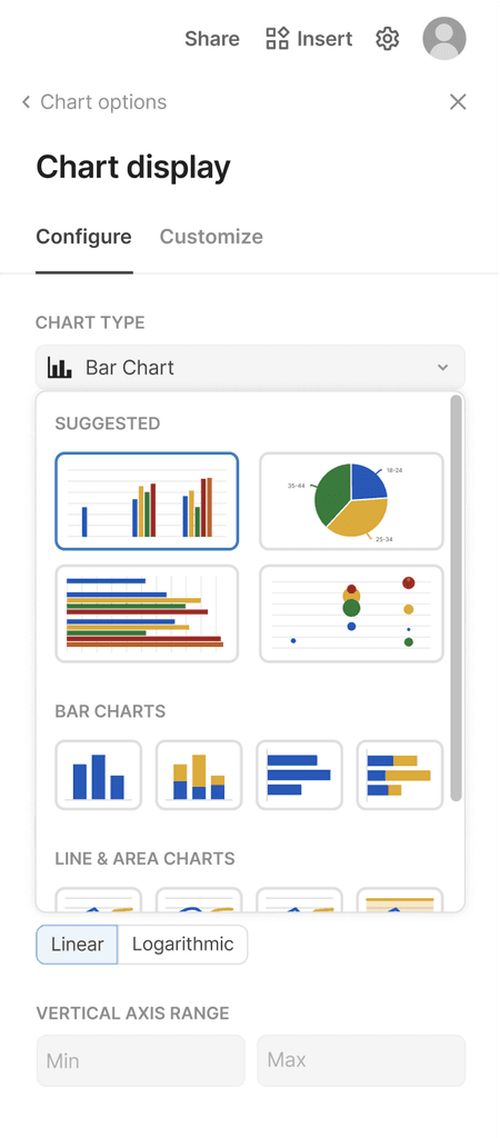
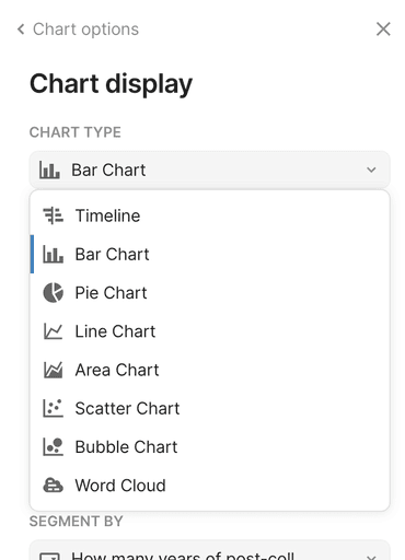
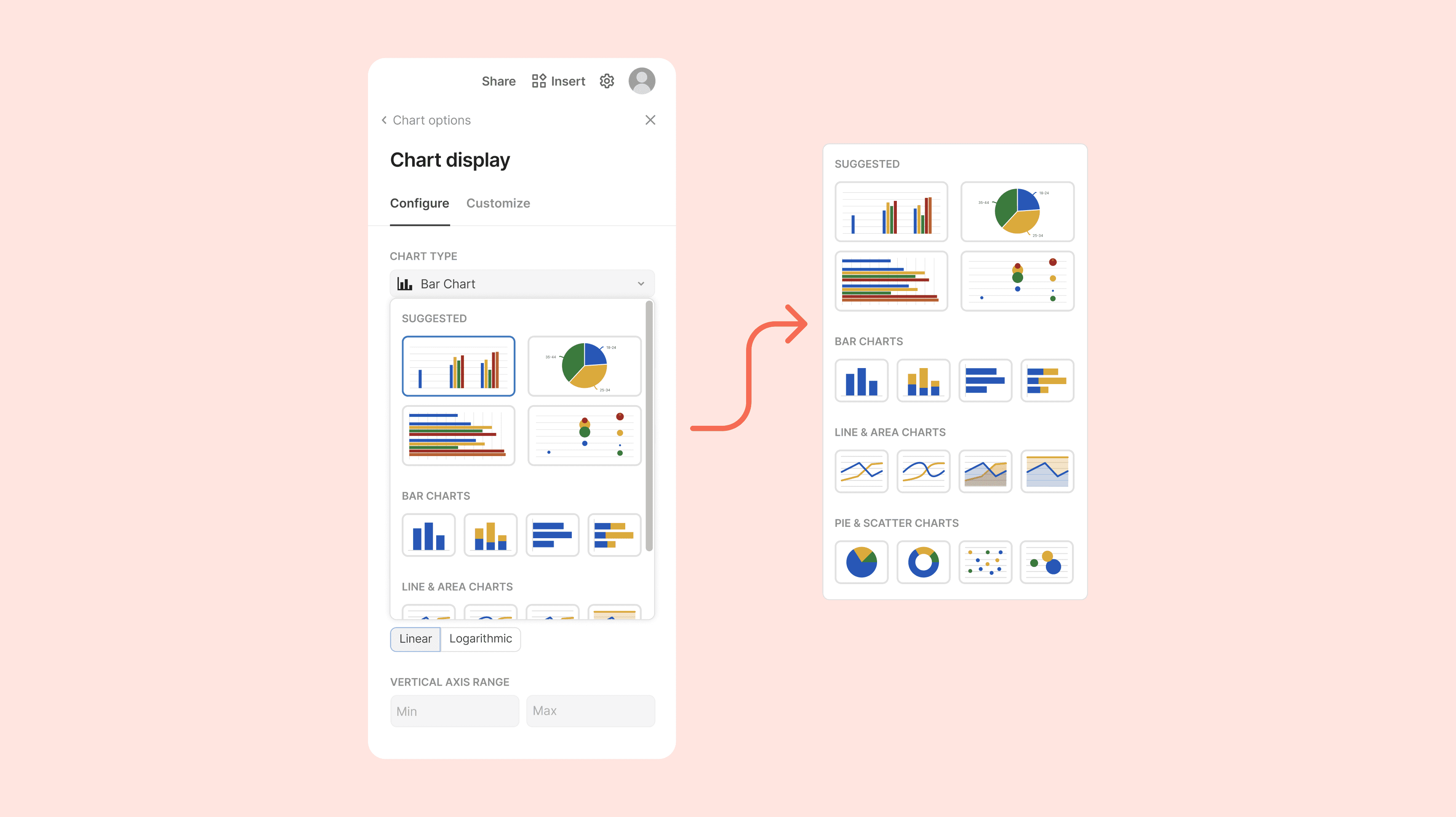
Users struggle with setting up charts, especially in terms of determining which chart type is most effective for their data type, as well as general formatting and configurations. Now, when clicking on the chart type, users are offered four “suggested” charts with a preview of how they would look with the existing data, as well as larger visualizations of the other chart options (ex. bar, line, scatter, etc).
To address the pain point of chart setups taking unnecessary time, there are now additional visualizations of chart options (ex. having a bar chart be horizontal or vertical).
New smart recommendation feature for the Chart Type dropdown.
Solution #3: Improve access to data/row editing within the chart.
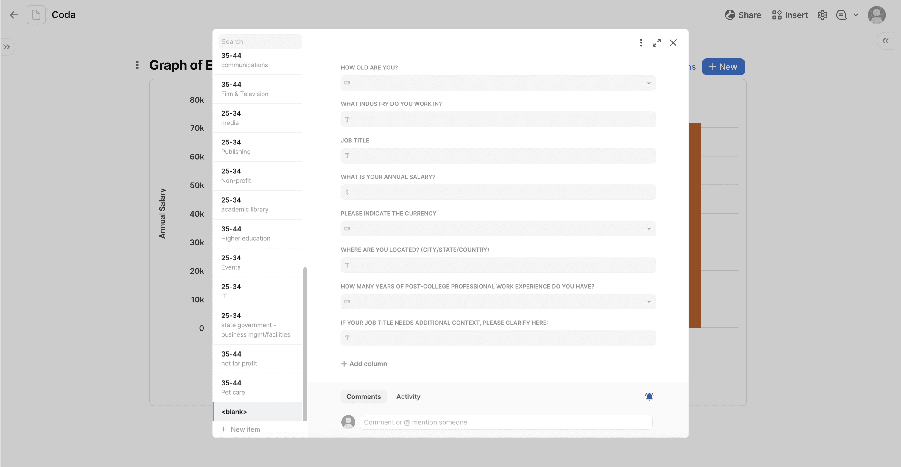
Currently, Coda offers the opportunity to add new rows to the table that a chart references, but the text hierarchy of the interface makes it difficult for users to interact with, and the arrow navigation makes editing other rows a hassle. To address this pain point, I drew inspiration from Coda’s current “Detail” table view, and implemented a popup with more row details and easier navigability.
Now, the new row feature opens a popup with the new row information on the left of the screen, which has the headers all at the same size, creating a familiar user experience to the other form interfaces used throughout Coda. To the right of the popup is a list of all of the rows in the table that allows users to preview the information on each row, as well as a search bar to quickly locate items. The icons in the top corner allow users to easily close or expand the popup, or access more settings.
The redesign of this feature creates a more intuitive editing feature for users that allows them more options for both row editing and database navigation without leaving the popup. This creates both a more efficient, localized experience for both adding new rows as well as viewing and editing the existing rows within the table.
Redesigned ‘New Row' pop up with advanced editing capabilities and more familiar visual hierarchy.
Solution #4: New export & chart view features!
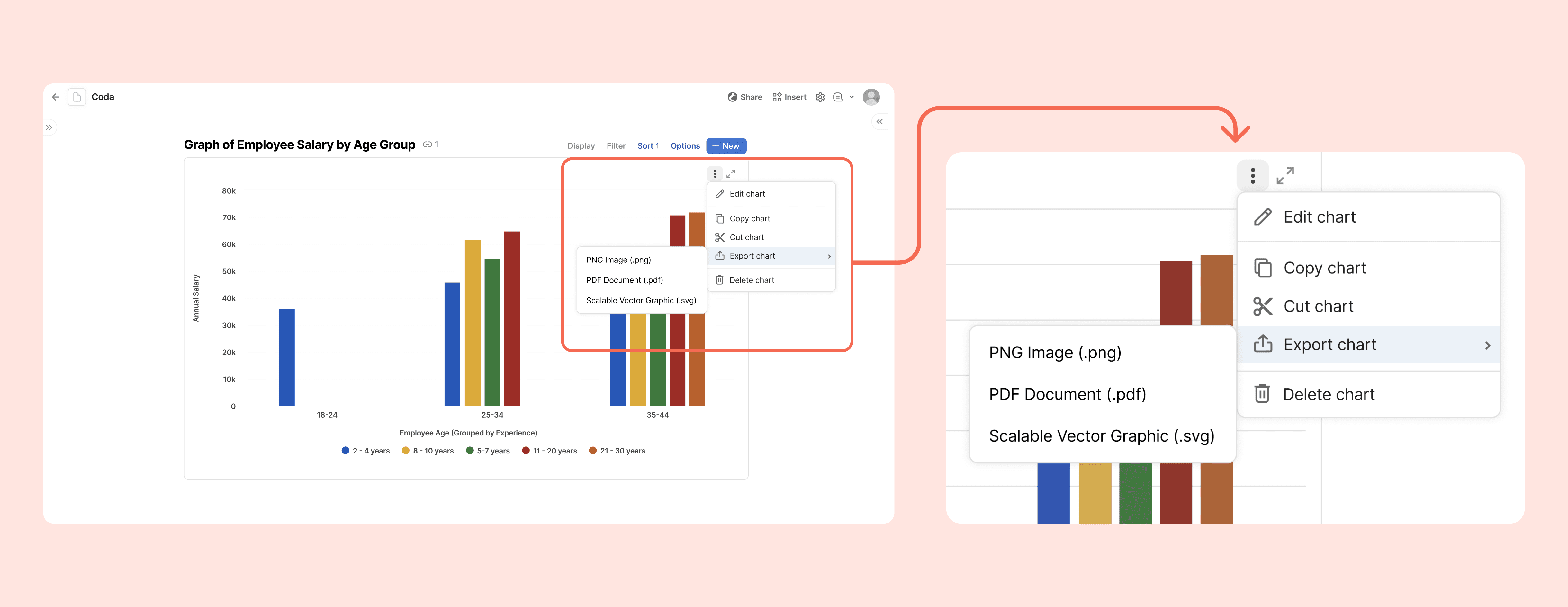
Currently, Coda doesn’t offer export features for graphs — a pain point that is leading users to turn to competing products. To fix this, I implemented a kebab menu within the graph with relevant export and chart settings. This allows users to easily download their charts as either a PNG, SVG, or PDF, and prevents them from needing to use alternate softwares or taking screenshots of their graphs to access them elsewhere.
Next to the export menu, I placed a button that lets users enter a full screen mode to have a larger view of their graphs. This was implemented similarly to the existing full screen icon in Coda’s “Detail” view table setting, and allows users to more easily interact with data visualizations on a larger scale.
New chart export feature and full screen view button.
impact of the redesign
Why Should Coda Invest?
Streamlining the data visualization creation process not only enhances the overall user experience by minimizing confusion but also significantly boosts user productivity. The proposed redesign promises a reduced learning curve, making the platform more accessible to new users.
It’s important to recognize that data visualization is a slippery slope — there are truly unlimited options for the ways that graphs can be customized. However, for Coda specifically, these small but impactful interaction and experience-focused changes provide an opportunity to set itself apart from similar data-focused collaborative workspaces.
Looking forward, I would love to conduct more detailed user testing about the specific chart types and how they can be used to accommodate different forms of data to learn about the prioritization of this design. Given more access to Coda’s resources, I’d also want to explore the feasibility of the features that this redesign suggests, as well as experiment with other possible features that promote data visualization for users.
design challenge Reflection
Things I Learned…
Not every problem has the design process. Each problem has its own unique set of complexities, and can’t always conform to the same structure of research, prototyping and design. For this study, I realized that it was more effective to focus on the current product experience rather than the comparative analysis of other products that are more focused on statistical complexities (ex. Google Sheets).
Utilizing existing design systems. While I didn’t have access to Coda’s design system, I learned a lot from exploring their existing product and mimicking the style of their existing design decisions. This was a really interesting opportunity to understand why their design team made the decisions that they did, and how I could replicate that same mindset for my redesign.
Organization is key. Throughout the process of this case study, I amassed a LOT of information, whether it be online reviews, user testing insights, or design inspiration from existing features. Keeping everything organized was essential for making sure that I could draw connections between my different ideas — fun fact, I used a Coda doc to put everything together!
Thanks for reading :)
Check out some of my other projects!
Made with <3 in Seattle, WA.
